On this page I will give you a data deep dive. I will explain which kind of data I pull and why, what to look out for and how a possible statistical approach could look like to create studies that are similar to those in Equity Crowdfunding. Both topics, NFT collections and Equity Crowdfunding share many vital points, like roadmaps, quality of founders and their background, accumulating capital and possible advisors.
Additionally I will use the advantages I received from the cooperation with flips.finance to show you possible options to come closer to better evaluations. Thank you flips.finance!
Daily reports
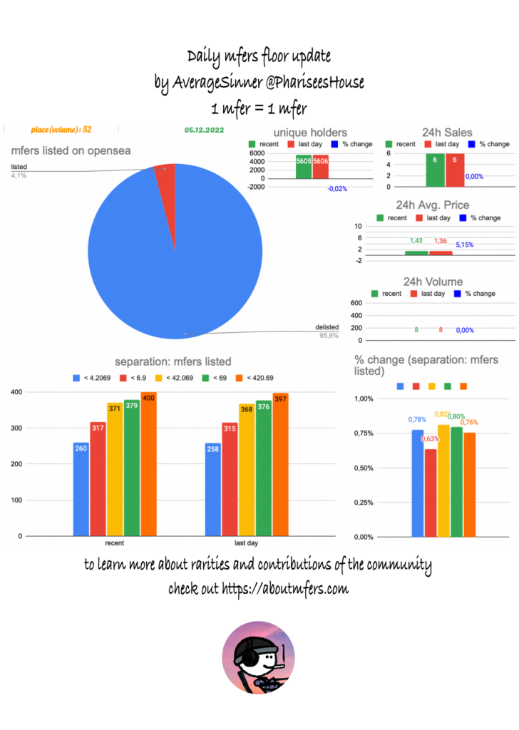
The daily report shows different kinds of data, like the volume, the listings (total + different areas) and the unique holders count. If the volume is above > 0, it should be put into perspective, therefore I also refer to the place the collection has on flips.finance. A better indicator would be the % of all NFT collections, since the place doesn’t show the possible multipliers of earlier listings. I would call this new variable “volume share”.
When you look at the current volume, you should look at it in combination with the unique holders count. Why? Well, imagine the following scenario: volume goes up a lot and the unique holders count shrinks. If you follow me, since a long time, then you know, that I always wanted to measure the conviction of holders. I will explain later, what I mean with that. In the mentioned case two scenarios are possible: 1. Many people increased their mfers count, 2. Few whales increased their mfers account. We have no data yet, to know which scenario is more bullish, but I would assume the 2nd scenario should be more bullish, because it would indicate a change of conviction among many! Conviction causes people to hold their NFTs longer, which causes a scarcity of listed NFTs and that increases the demand and last but not least the price.
Therefore another variable that might be worthwhile to add would be a variable, that shows the average amount of mfers bought per buyer. -> Sales 24h / unique buyers 24 h. This variable would be still imperfect, but in combination with the amount of buyers it would be a good indicator. The best solution would be a daily screenshot of the wallets that bought mfers in perspective to the amount of sales. The reason why I do not include this daily is because I believe that these measurements are useful in rare situations (the detailed lists). A detailed list would help to increase the depth of insight on a high volume day while imperfect variables measured and compared over time might help to compare collections with each other to see trends earlier that might be correlated with the imperfect variable “Sales 24h / unique buyers 24 h”.
Rarity Reports
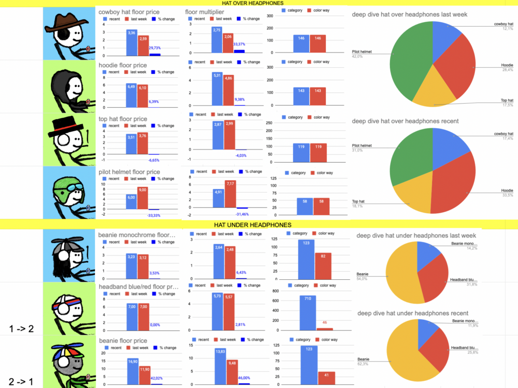
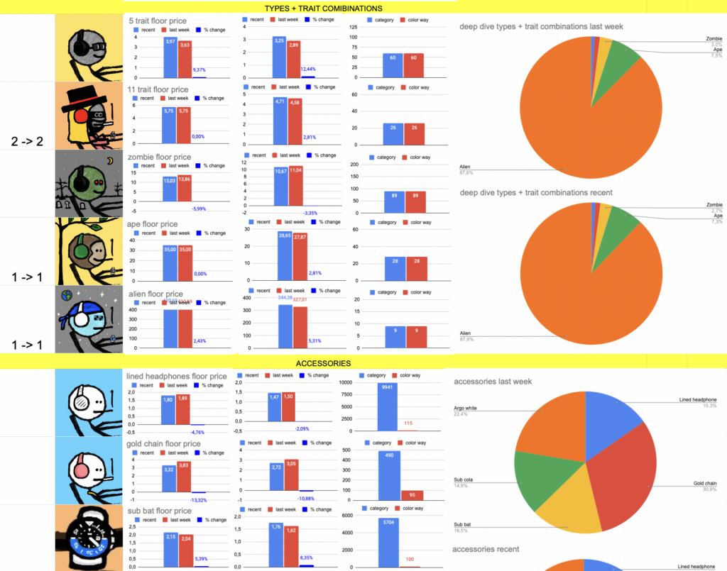
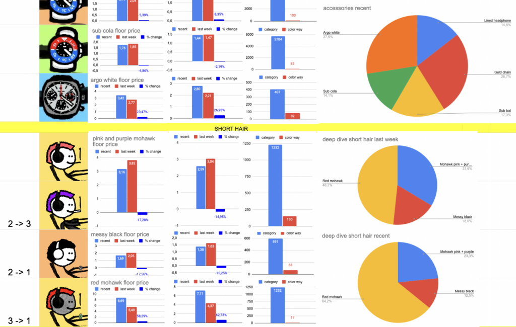

The rarity reports show different indicators like the total floor price and its change between weeks, as well the differences between 1. unique traits with unique frames and one color way and 2. rare color ways. The floor multiplier is a variable that tries to capture the price evaluation in regards to the current floor price / the floor price from last week. The floor price is the average of the 3 cheapest listings, if one listings is more expensive than 3 times the previous listing, it does not count. On the left side you can see the amount of listing if they were below the critical threshold of 3 at one timestamp (last week -> recent).
The goal of the rarity reports it to come as close as possible to the market evaluation of a particular trait. Since these rarity reports are based on listings, they have multiple flaws. For example non realistic listings can be used for example 420.69 ETH for an alien mfer. Back in the days an alien mfer was sold, for 80 ETH I believe, while the floor price were similar or higher than now. Another thing that occurs when liquidity / amount of listings is low, is, that less rare color ways are listed more expensive than rarer color ways of the same trait. What do both flaws have in common? They only occur, when we use the listings as the crucial indicator. Something else that is entirely missing are accepted low ball or high ball bids. Which variable could capture all of this? Last sales.
Would the variable last sales be enough as the only critical variable? No…, actually not. It would only be enough if the most recent sales happened in the exact same timeframe for all rare traits. Why? Well imagine floor price is 3 ETH and mfers are bought with the trait “messy black” for 5 ETH. Now the floor price decreases to 1 ETH and people buy “hoodie” mfers for 5 ETH. With the variable “last sales” we would assume that both have an equal market evaluation but they have not. If we use a floor multiplier we would get the result of 1,66 for “messy black” (5/3) and 5 for “hoodie” (5/1), which would be much more realistic.
Therefore the critical variable should be most recent sales, instead of listings, but it needs to be combined with the floor price at that particular date to be comparable with other traits! The lower the volume of a collection over a certain time is, the more important is the addition of the floor multiplier.
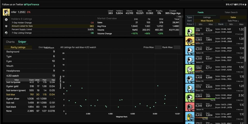
This screenshot shows the sniper tool of flips.finance. If you have a pro account you can select a collection and then click on “Sniper” instead of “Charts” on the left side. Beneath “Sniper” you can select the trait you are looking for. What is missing? The floor multiplier at the date, when the sale occurred ;).
Community overlaps
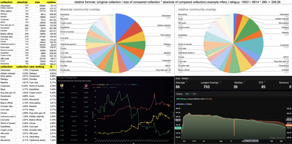
While absolute data suggest, that otherdeed and Adidas originals share the most with the #mfers community. Relative data suggests that it might be @osf_nft, @cryptoadzNFT and dooplicator.
Data: On the left you can see the absolute amounts of mfers who hold NFTs of other collections. There might be a problem with that data. Why? Well let’s assume that a collection has 100 000 NFTs and another one has 1000 NFTs. Mfers might be holding 1000 from the 100k collection. And 400 from the 1000 collection. Where is the catch? Mfers would be holding 40% from the 1 k collection, but only 1% from the 100k collection. Therefore I implemented a new formula, which puts that difference into perspective. First we use the original collection size.In this case that would be 10021 for mfers. Then we divide that data trough the collection size of the compared data. We will get a “cleaner multiplier”. This multiplier in combination with the absolute overlap will give us the relative community overlap. This data can be seen in the bottom left. I also created a new ranking by relative % overlap. A visualization of the data can be seen within the pie charts, which show absolute and relative community overlaps. One addition, if anyone is confused why the example formula gives out 328,58 for rektguy, but the tables only show percentages. I divided 328,58 trough the sum of relative overlaps (3804,18) -> 328,58/3804,18 = 0,08637 -> 8,64%. I also created a comparison with the rektguy nft collection and displayed the graph for the community overlap between mfers and rektguy over time. Most graphs between mfers and other still established NFT collections look similar. I didn’t figure out why yet…
How to get this data on flipsfinance? When you have a pro subscription, simply click on pro and then on “intel”. Then you can select any NFT collection and compare it with others. I didn’t make a review of the category “market” yet. This will take an additional report.
